Tuesday 7 May 2013

SURVIVOR STYLING

CLOTHING


I thought about using some sort of black lace accented clothing, whether it be a nightgown or top, to link together the murderer, survivor and fabrics. I also wanted it to highlight the story (she had slept in her clothes from the night before in an effort to not wake her friend), and themes of darkness and a lethal presence.

Alternatively, I could use a white dress, to act as contrast from the darkness and murderer, also symbolising life and escape.

I do however want the chest and neck area bare, as I feel that this area is somewhat vulnerable to attack (jugular), and I could place some material around her neck, slowly tightening as the threat of death increases.

PHOTOGRAPHY

I want to try and utilise some of the photography skills I learnt at A level for this project, to add to the uneasy feeling I want the audience to experience. This will allow a more disturbing image without cheapening the piece with gore etc.

MURDERER: Multiple Flash

A Level Multiple Flash
Studio Plan


This sketch shows the layout of the studio. I will need to change the shutter speed to 'bulb' so that the shutter stays open whilst the shutter release is held down (rather than closing after taking the image like usual). I will require an assistant to fire the flash when prompted whilst I control the camera after each position the model changes to.

I wanted to use this effect for my murderer shoot, to give an inquisitive, fast moving and adaptive feature to my character; similar to a cat playing and toying with its prey.


SURVIVOR: Slow Sync


I would like to use this effect to photograph my survivor shoot, by adding in the mouth of the murderer to the side of the portrait, but having it fade away into the darkness.

The set-up is relatively similar, however I will need one softbox to provide continuous light, whilst the other flashes as I take the shot. This will give a ghostly smudge of a feature across the image.


Friday 3 May 2013

EVALUATION

I feel happy with my final images, as I believe that they represent a good interpretation of the brief and bring a balance between the themes of horror and fashion. However, I feel that this project lacks a lot of background research on the blog, due to not being able to find suitable references for ideas I had imagined. By practicing drawing and painting over the summer I hope to remedy this, so that all my ideas are represented fairly and give my audience a clearer insight into my design process and inspirations. I also think that more experimenting and testing is needed to solidify ideas on styling and photography, including model choice. I also want to prepare budgets for each unit next term, so that I have money to spend to make sure I can effectively communicate my ideas through image via styling, makeup and hair.

Hair is a particular area I need to improve on, more so the design rather than execution of ideas. I find that it is very secondary to my make-up design, and that I have only a limited pool of styles that I can utilise. Perhaps by watching youtube videos and flicking through hair magasines I will learn different techniques that I can apply to future projects. I do feel that in this project I have got a lot more to grips with blogging my ideas, but want to again improve in terms of uploading daily even if only to voice concerns on the project or to post a few images I had found relevant, and learn more about showing my ideas in an effective but visually interesting and stimulating manner.


Overall I am quite pleased with the outcome of this unit, and can feel my confidence growing with every look I create in the studio.

FINAL IMAGES OF SURVIVOR


I also love these images, as they are very subtle in their symbolism; all lies in the detail. However, I wish I had alternative styling to make the images more diverse, as when choosing my two finals images to submit I found that my favourites were all very similar in pose, styling and overall composition. Maybe by pulling back and taking a longer shot of the model to expose more styling could have remedied this.

FINAL IMAGES OF MURDERER


I am happy with the position of my model, but think that I need to improve a lot on my editing skills, in order to give a more realistic background. Alternatively I could book out a larger studio ahead of time to practice such positions and images to make sure I can be completely happy with their final outcome. Finding a model that had background in performance or dance/gymnastics would have helped too, with positions and posing.


I am VERY happy with this final look. I think it has the right balance between fashion and horror, giving it a slightly eerie feel without being overwhelmingly terrifying to view.

FINAL SHOOT - murderer


I am really pleased with these images, as I felt that I could have the model pose in multiple ways due to the number of details that I wanted to capture; From the bloodied hands around the face, contortion on the floor, and wrapping herself in a cloak of darkness. These images will need a lot more editing that the survivor images however, to darken them without losing the detail of make-up and styling. I am a lot more pleased with this hair, as it is much more wet look and neat than the previous shoot.

FINAL SHOOT - survivor


I was very happy with my final shoot, as I feel that I got the balance just right between fashion and horror, using subtle symbolism to add a hint of uneasiness and doubt to the beauty of the images. I like the reference to the Christian religion that I drew on with the roses and blood, symbolising a crown of thorns, and I feel that the fabrics work well creating an illusion of darkness or blindfold.

Sunday 28 April 2013

TESTING TESTING TESTING


This was my test-shoot for my murderer make-up and hair, however I was very displeased with the quality of the hair, and I felt that the model was also the wrong choice for the look. 

It is important to get a model that will be comfortable and almost daring in front of the lens, to get the desired pose and effect you imagine when creating the look; unfortunately this model was uncomfortable and did not work well in the studio. I also feel that her face shape was not right for the role, as I wanted to give a more contorted, long shape to my character, however this model has a more round, plump face. I like the eye makeup, as I feel it looks smokey, and works well with the model's brows. I will re-shoot this with another model and a different hair style to see if this makes any improvements; if not I will have to go back to my face charts and design something more suitable.

MURDERER STYLING

I want the murderer to be very slinky, contorted and adaptable to its environment; thinking along the lines of a more lethal catwoman...

For this I want to style my model in disco pants and a high neck top, as if she has suited up to hide amongst the girls' bedroom.

Another reference I thought of was a character from CSI, "Sqweegel" who wore a latex body suit:


http://youtu.be/lHZjOgP8Las - a further youtube clip on the behind the scenes of the character


SURVIVOR STYLING

FABRICS


I went to a local haberdashery shop to look for possible fabrics that I could use to style my looks; wanting to re-use at least one fabric for both characters to link the pair (used in different ways of course). I came back with two large pieces of fabric and a line of black fabric roses.


I picked up the roses, as I thought I could trial them as a blindfold if the hair doesn't work, and also I liked the imagery and symbolism of using black flowers; reflecting the death of a young girl and innocence. If I use them other than a blindfold, I want to smudge some 'blood' onto some of the petals, again tying in the urban legend.


 The other materials are a variation on a sheer mesh, one more wiry, stiff and sparse than the other. The fabric on the left is a lot more sparse and could be used to create a good pattern by printing colour through and onto the face of my murderer (tying the characters together) as well as a more structured veil around the survivor.


The fabric on the right has a lot more elasticity to it, and could be nice stretched across the models face, giving a similar effect to the visuals from Illamasqua's new collection, "Paranormal".


Further examples of how I might use the fabrics & general inspiration


SURVIVOR


For the make-up, I wanted to keep the survivor very natural - following the theory of the Final Girl - with a fresh, dewey complexion, light blush and minimal eye make-up. I want the focus to be on her styling and hair.


 Carrying on the theme of not being able to see and darkness, I thought about using the hair (wet-look and slightly distressed) as a blindfold, and applyng a small smudge on the outfit or hair of blood to reference the story and bloody message very subtly.


I also thought about creating a sheer black veil to create the illusion of darkness, with the hair piled on top of the model's head in a full ponytail, coming round and across the face underneath the fabric.


MURDERER


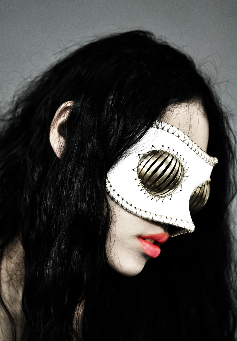
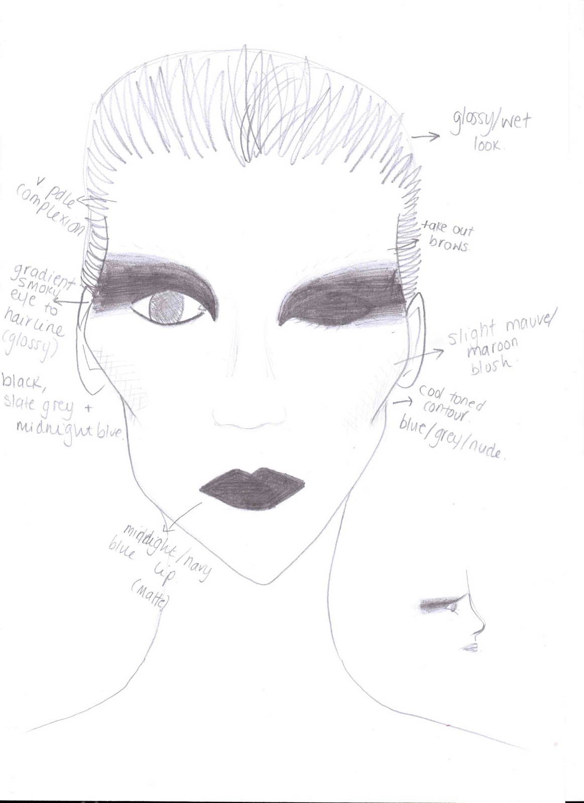
These are my initial face charts that I had developed over a course of a few days as my vision of my character morphed from conducting research and thinking about creating a fashion based make-up. I wanted to ensure the theme of darkness and camouflage.


TESTING


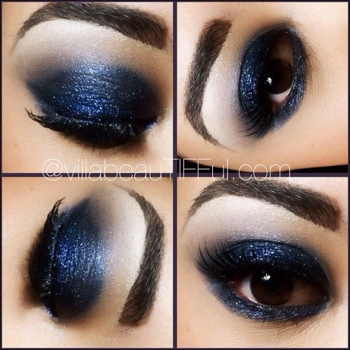
I started using a black liner to create an exaggerated cat eye crossed with a mask (representing the dark) that flicked up toward the hair line to give a playful yet sinister impression. I felt that it was too harsh, so kept the top line very clean and hard, yet blended out the bottom edge into a more slate grey colour and smokey texture.


I then added a small amount of Illamasqua's liquid metal in superior along the inside of the shape, to give more dimension rather than a flat black mask.


I then experimented by trying to keep the intensity of the black in the centre of the shape, and blend out from both edges. I feel that if I kept applying and blending that I would get the desired effect.


On the other eye, I trialled keeping the concentration of black on the lid, and blending again outwards. I feel that this is more effective than the previous attempt, as it looks less messy (other than its intentional distressed/smokey appearance). I think I will merge the two eyes together for my final look, but block out the model's eyebrows. I like the contrast between the black and the blue of Tasha's eyes, so will try to keep this if I decide to use another model (I would prefer a model with darker hair for this character).

I quite like the effect of having two different shapes on the eyes, to add the idea of insanity of the character, however I don't feel that such a drastic difference will translate well into an editorial piece.

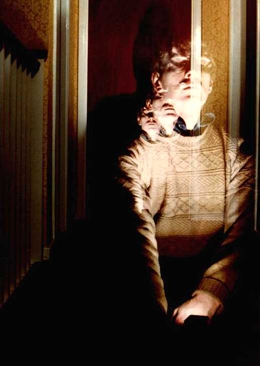
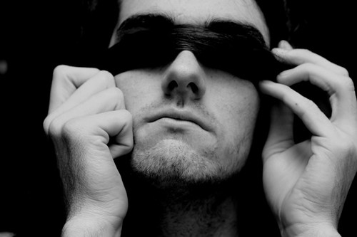
The idea of smoke came to me during trials, similar to the movie The Fog, carrying on the theme of not being able to see and something sinister coming out of the abyss.